Personal palette generator
What colors look good on me? Build your personal palette
What makes a color look good on you
When a color matches your coloring, skin looks more even, shadows under the eyes soften and your eyes look clearer. When it doesn’t, the color arrives before you do: redness, shadows or a grey cast become easier to see. None of this says one skin tone is better than another — it’s about harmony between the color and you.
Three dials decide most of it. Undertone is the hue beneath your skin. Depth is how light or deep your skin, hair and eyes are together. Clarity is whether clean, saturated colors look alive on you or overpower you. Contrast — the gap between your lightest and darkest features — fine-tunes the rest.
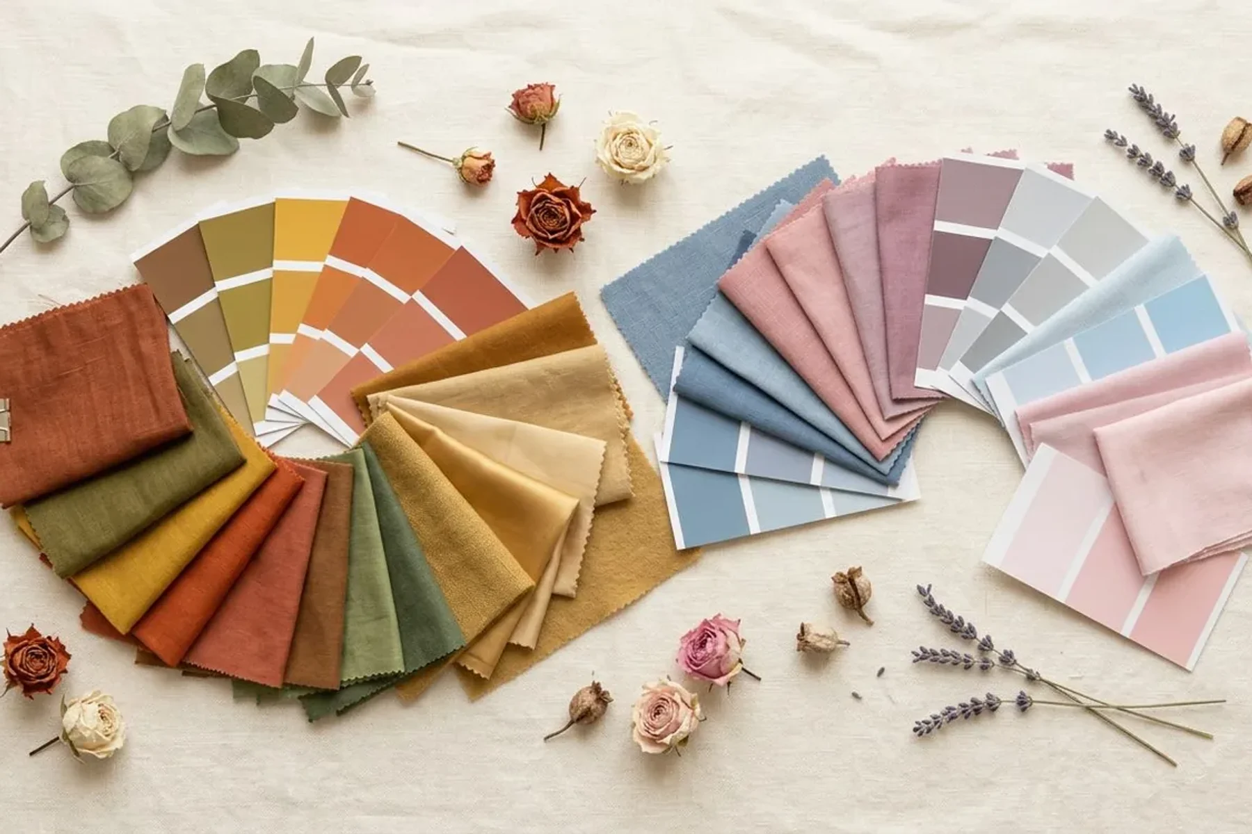
Colors by trait — a starting table
| If you are… | Usually easy | Test carefully near the face |
|---|---|---|
| Cool | Blue-reds, rose, plum, navy, soft or icy white | Orange, mustard, camel |
| Warm | Coral, peach, olive, camel, warm teal, cream | Icy pastels, blue-grey, stark white |
| Neutral | Dusty rose, soft teal, jade, taupe, off-white | The most extreme version of either side |
| Olive | Muted jewel tones, olive, teal, plum, warm grey | Very pale pastels (can look chalky) |
| Light | Light to medium colors, gentle contrast | Head-to-toe black, very heavy darks |
| Deep | Rich darks, deep jewel tones, crisp contrast | Washed-out pastels on their own |
| Soft | Greyed, blended colors; tonal outfits | Neon, high gloss, stark black and white |
| Clear | Saturated, clean colors; strong contrast | Dusty colors that flatten you |
These are starting points, not rules. Fair skin isn’t automatically cool and deep skin isn’t automatically warm.
Your white, your black, your navy
| Season family | Whites | Dark neutrals |
|---|---|---|
| Spring · warm and clear | Ivory, cream | Warm navy, milk chocolate, warm charcoal |
| Summer · cool and soft | Soft white, grey-white | Charcoal, blue-grey, soft navy |
| Autumn · warm and muted | Cream, oyster | Chocolate, olive, deep teal |
| Winter · cool and clear | Pure white | Black, true navy, charcoal |
Test one variable at a time: pure white against ivory first, then black against charcoal, deep brown or navy. If black feels heavy at the neckline, wear it below the waist and keep a palette color near your face.
Check a color at home in two minutes
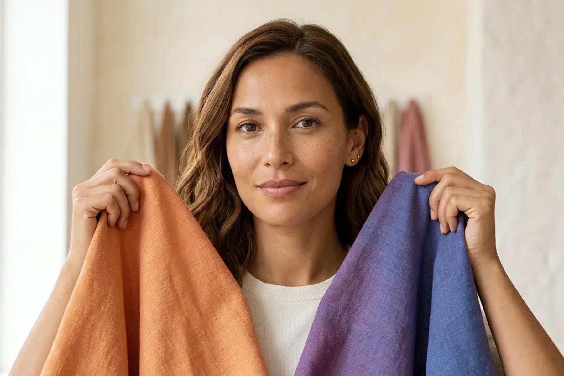
- Stand facing a window in indirect daylight; switch off warm bulbs.
- No makeup, hair pulled back, a plain white or grey top.
- Hold two colors of similar depth under your chin, one after the other.
- Watch your skin, not the fabric: which one evens out shadows and redness?
- Trust the choice that repeats. If it’s a tie, both work.
Same photo, same palette
Your palette comes from measurements, not from a model that writes a new answer each time. Run the same photo twice and you get the same colors, with the readings that produced them shown above. A different photo or different light can move the reading — which is why every result shows a runner-up and the colors both seasons share.
Questions people ask
Want every decision made for you?
The full report (Complete plan) adds reasoning from a vision model, a 24-color palette, 3 hair plans with 6 AI try-ons that keep your face, glasses and outfit ideas. One-time payment; photo deleted from our systems within 24 hours.