12-season guide · interactive wheel
Seasonal Color Analysis: the 12 seasons explained
Short answer
Hover or tap a segment to preview a season; every season links to its full palette.
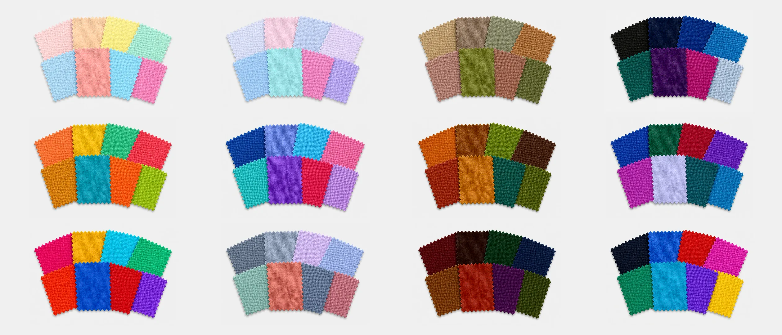
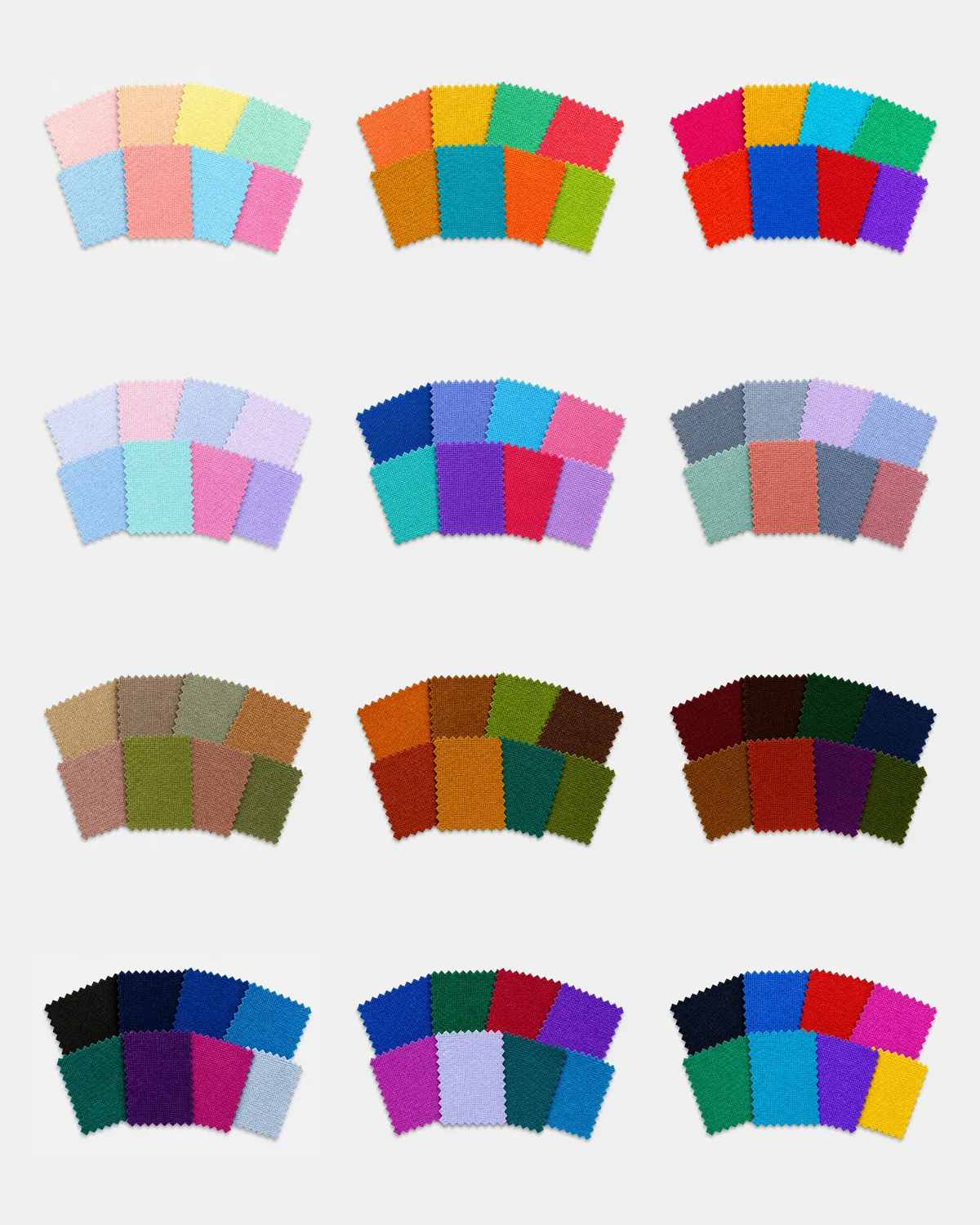
01 — Three dimensions
Every season is a mix of three traits
Consultants judge them in order — temperature first, then depth, then chroma — by holding fabric under the chin and watching what happens to the face.
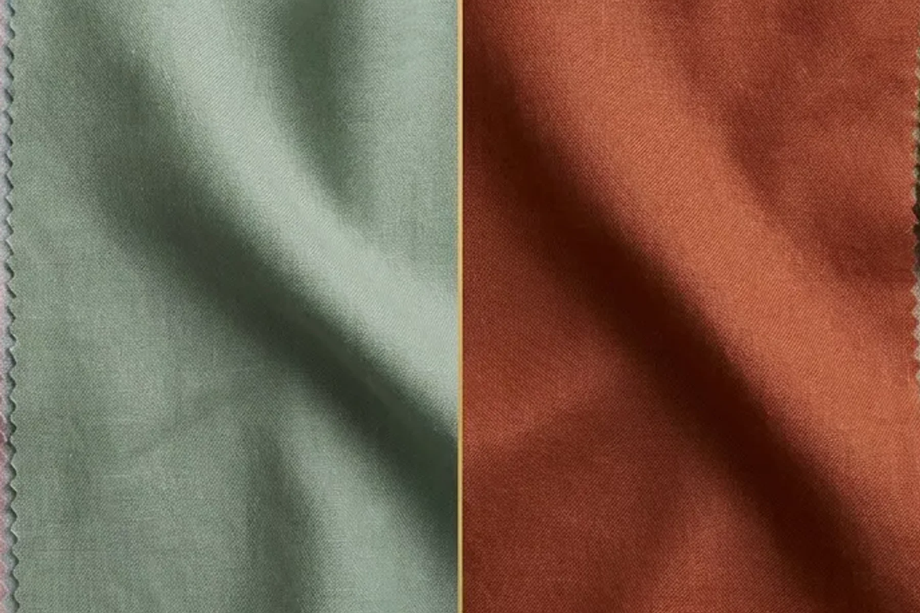
Whether blue-based or golden-based colors look more even next to your skin. Undertone isn’t how light or dark you are — that’s depth.
About the undertone test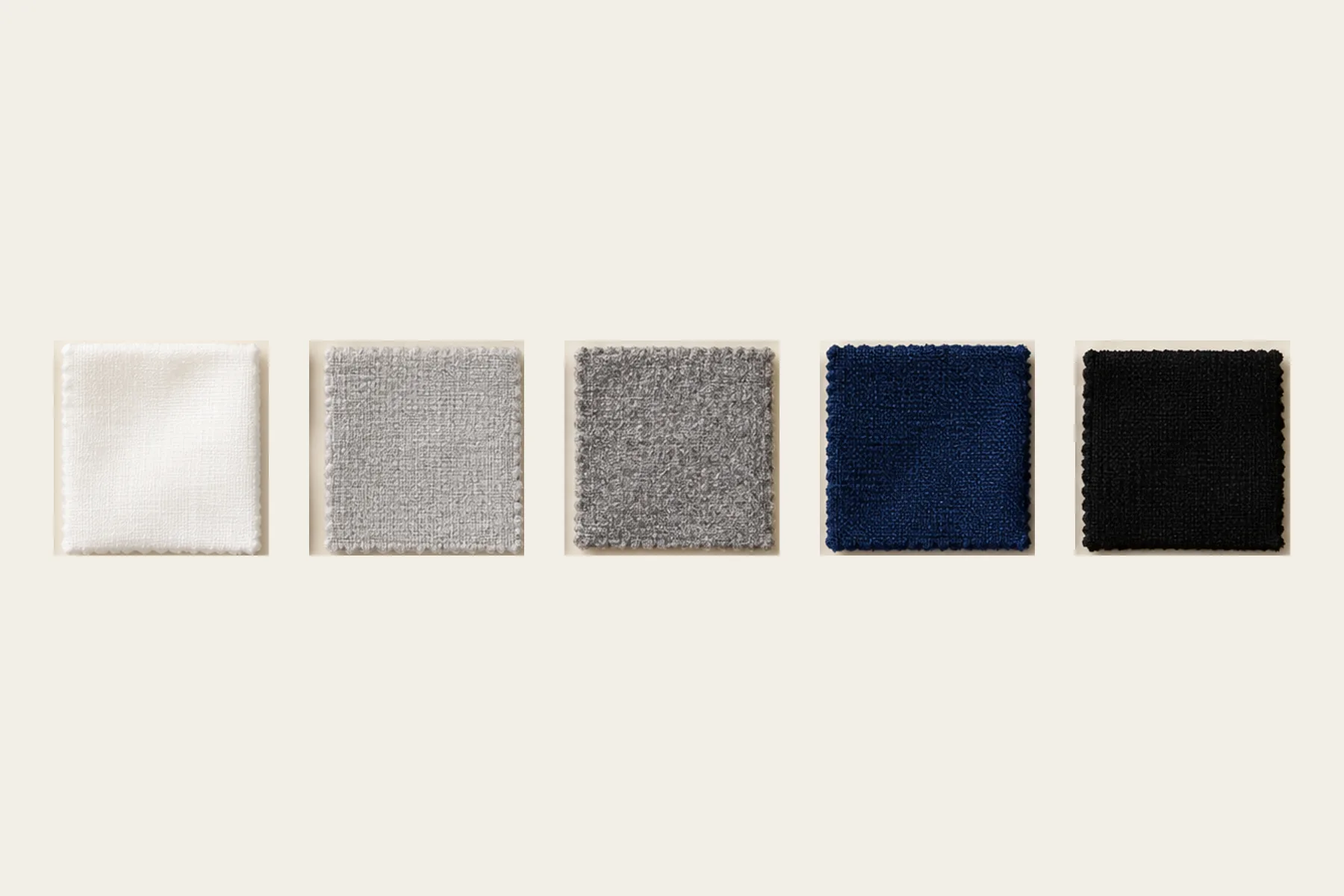
The overall lightness of hair, skin and eyes together. Light seasons are overpowered by heavy darks; deep seasons can look washed out in pastels.
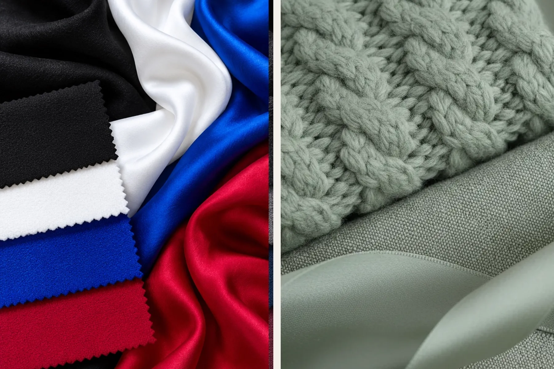
How clean and saturated a color can be before it starts to stand in front of you. Soft seasons suit greyed, blended colors; bright seasons suit vivid ones.
02 — 4, 12 or 16 seasons
Same idea, finer slices
Four seasons
Temperature first (Spring and Autumn warm, Summer and Winter cool), then light vs deep and clear vs muted. Easy to start with, but many people fall between two seasons.
Twelve seasons
Each season split in three and named for its deciding trait — Light, Deep, Soft or Bright — with the purest warm or cool version called True. Neighbors often share one or two traits, which makes comparisons concrete. This site uses 12.
Sixteen and beyond
Some consultants add further in-between types. The palettes get more specific, but the extra boundaries are harder to judge from photos — more useful in person, with real fabric.
03 — The four families
Four families, three seasons each
Spring
Warm and clear — light, fresh colors.
Summer
Cool and soft — airy, blended colors.
Autumn
Warm and muted — rich, earthy colors.
Winter
Cool and clear — deep, high-contrast colors.
04 — Neighbors
Where people get stuck: neighboring seasons
Most uncertainty sits between two neighbors that share one or two traits. Each comparison page sets out three color pairs side by side so you can see the difference; with a plan you can also try them on your own photo.
05 — Common misreads
Four things that make a season look like another
Hair dye
Dyed hair changes the contrast and temperature around your face. Judge drapes against your natural roots, or with hair covered by a neutral towel.
Makeup
Foundation, bronzer and lipstick add their own temperature and depth. Test bare-faced first, then add makeup within the palette.
Lighting
Warm bulbs make warm colors look better; cool LEDs and overcast light do the opposite. Indirect daylight near a window is the fairest test.
Tanning
A tan adds warmth and depth for a few months, which can shift your read toward a warmer or deeper neighbor. Re-test once it fades.
Looking “tired” in a color is a visual effect of contrast and reflected light, not a health signal.
06 — A short history
From a Bauhaus classroom to your phone
1920s–1961
Bauhaus teacher Johannes Itten noticed that students’ preferred color harmonies tended to echo their own coloring and grouped them by the seasons — an idea he later described in The Art of Color (1961).
1950s–1980
California color consultant Suzanne Caygill built a seasonal method for clothing and interiors, published as Color: The Essence of You (1980).
1980s
Carole Jackson’s Color Me Beautiful (1980) made the four-season system a mainstream idea.
1990s–today
Later systems split each season into three by dominant trait (12 seasons), and some consultants use 16 or more. Photos and online tools make it easy to explore — and easy to misread, which is why lighting and side-by-side comparison matter.
07 — Questions
Seasonal color analysis, answered
Updated Oct 2026
Five rounds to your closest season
Our drape test holds virtual drapes up to your own selfie over five rounds and gives a closest season with a runner-up. It needs an account and a plan. The comparison pages above also set out the key pairs side by side.