Spring family · 12-season palette
Bright Spring Color Palette
Short answer
24 colors · tap to hold one at the chin & copy its HEX
Warm-leaning
Medium
Vivid

01 — Character
Bright Spring at a glance
Bright Spring is the high-voltage end of spring. There is usually noticeable contrast between hair, skin and eyes, and eyes often look sparkling or glassy. Clean, saturated colors with a warm lean — poppy, emerald, cobalt, hot coral — keep pace with that clarity, while dusty shades sit on the skin like a filter.
Contrast
Contrast is medium-high. Brights work best with clean breathing room — bright ivory, clear navy or white jeans — rather than muddy neutrals.
Deciding trait
Clear
Clarity decides first. Bright Spring has the highest chroma of its family: colors need to be clean and saturated to match the contrast in your features; its Spring roots lean them warm.
Undertone
Warm-leaning
Depth
Medium
Clarity
Vivid
02 — Palette by use
24 colors, sorted by the job they do
Base neutrals carry an outfit, main colors go near the face, and accents add a small dose. Tap any swatch to copy its HEX code.
Base neutrals
Trousers, coats, bags and shoes — the backbone of a wardrobe.
Main colors
Tops, knitwear, dresses — the colors that sit near your face.
Accents
Scarves, lips, jewelry and prints — small doses with impact.
Three starter formulas · 60 / 30 / 10
- Light Warm Grey60% · base
- Hot Coral30% · main
- Lemon10% · accent
- Bright Ivory60% · base
- Bright Orange30% · main
- Kelly10% · accent
- Clear Navy60% · base
- Emerald30% · main
- Raspberry Pop10% · accent
HEX values are for communication — screens and fabric differ, so check colors in person.
03 — Whites & black
Your white — and what to wear instead of black
Palette white
Bright Ivory
#FBF5E6
Whites
Bright ivory or a clean soft white; very stark white can work in small doses.
Compare against
Darks
Clear navy and warm charcoal; black works best broken up with a bright color.
04 — Metals
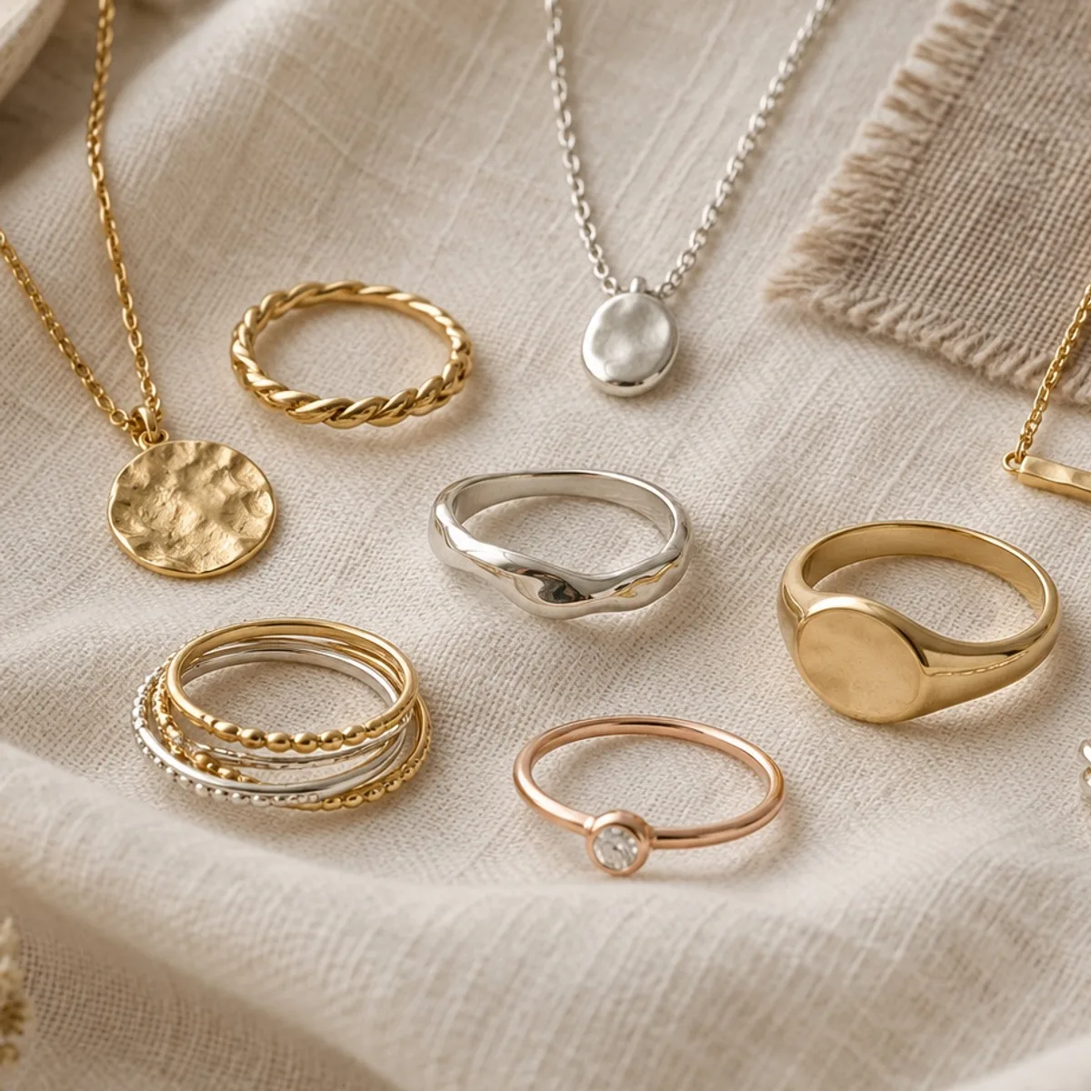
Start with gold
Polished gold, bright silver-gold mixes.
Finish
Polished, mirror shine — echoes clear coloring.
Compare pieces of similar size and shine, on the same side of your face, in the same light — and judge harmony, not sparkle.
Named for this season
05 — Hair color
Hair color directions
Rich golden brown, warm chestnut or clear copper with shine.
Directions to discuss with a colorist, not a formula — your color history and hair condition decide what’s achievable.
06 — Makeup
Makeup, by color family
Clear coral or warm pink blush, poppy or bright coral lips.
Color families only — we don’t recommend specific products.
07 — Outfits
Work and weekend, in Bright Spring colors
Your season narrows the colors; dress code, climate, budget and taste decide the pieces. Start from what you already own.
Work
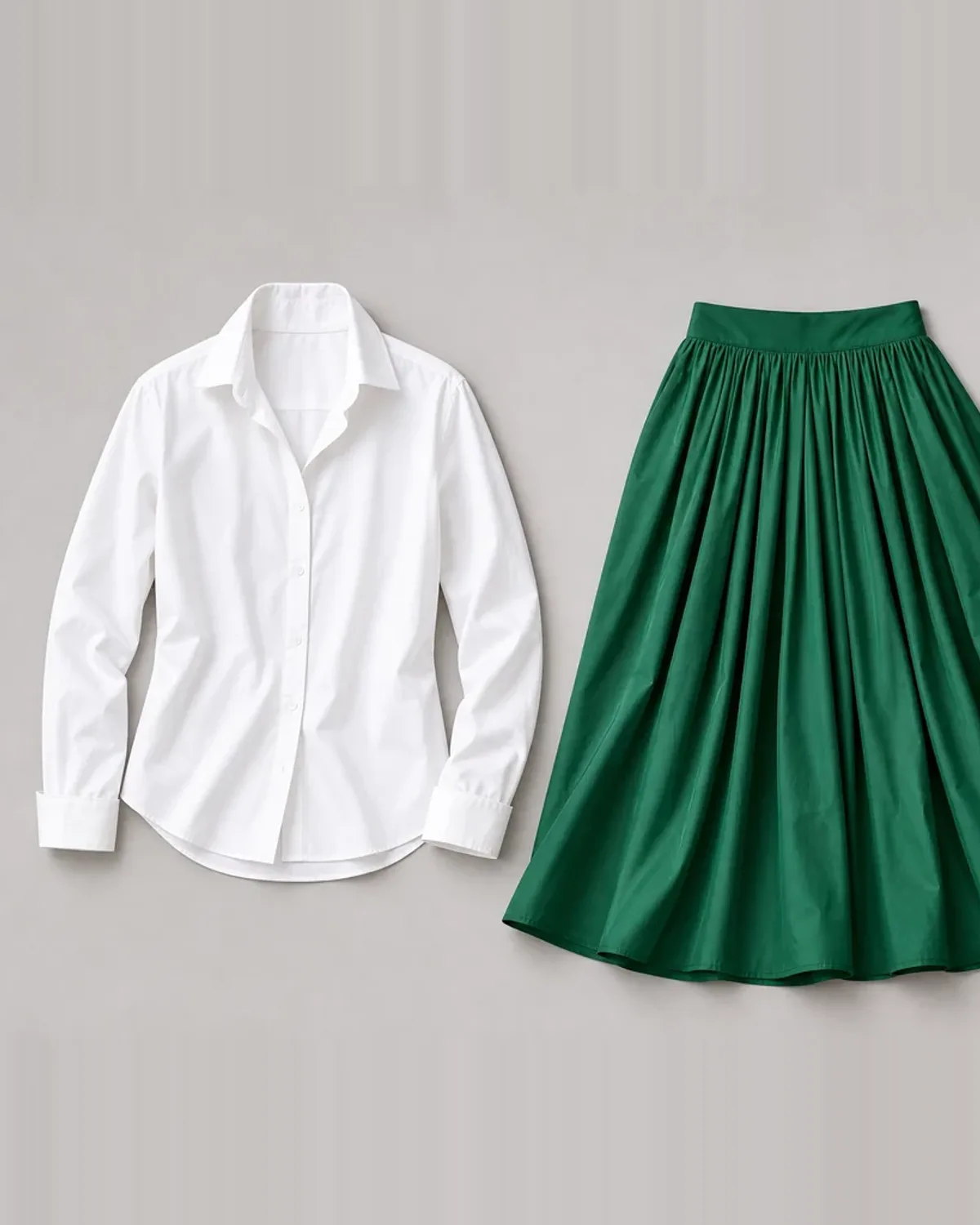
Clear navy suit, bright ivory shell, emerald scarf and polished gold.
Weekend & dates
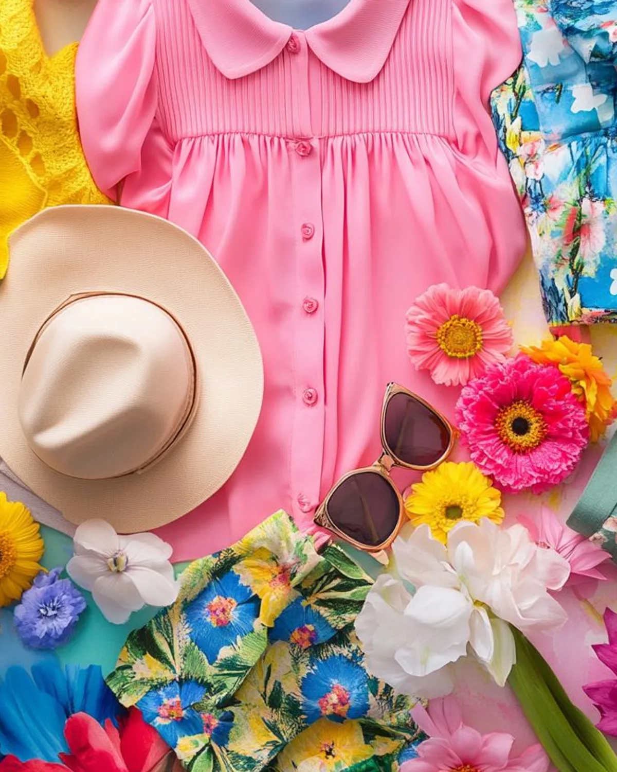
Cobalt knit, white jeans and coral sneakers.
09 — Neighbors
How Bright Spring differs from its neighbors
Seasons that sit next to each other on the wheel often share one or two traits. Compare them at the same depth, one pair at a time, in daylight.
| Trait | Bright Spring | Bright Winter | True Spring | Light Spring |
|---|---|---|---|---|
| Undertone | Warm-leaning | Cool-leaning | Warm | Warm-leaning |
| Depth | Medium | Medium-deep | Medium | Light |
| Clarity | Vivid | Vivid | Clear | Clear |
| Signature colors | ||||
| Best white | Bright Ivory | Pure White | Cream | Ivory |
| Metal to start with | gold | silver | gold | gold |
Bright Winter
Both are vivid. Bright Spring is warmer, while Bright Winter is cooler.
Try this pair at your chin
True Spring
Both sit at medium depth. Bright Spring is cooler and more vivid, while True Spring is warmer and less vivid.
Try this pair at your chin
Light Spring
Both lean warm. Bright Spring is deeper and more vivid, while Light Spring is lighter and less vivid.
Try this pair at your chin
10 — Common misreads
Four things that make Bright Spring look like something else
Hair dye
Very dark, cool-black dye can make Bright Spring read as Bright Winter. With your natural color, compare whether pure white or bright ivory looks better at the collar.
Lighting
Dim evening light mutes everything, so brights can look loud and soft colors falsely “safe”. Test brights in daylight, where your own clarity shows.
Tanning
A tan adds warmth and depth, which can make True Spring’s golden brights look better than cooler cobalt for a while.
Makeup
Bare skin next to a vivid drape can look plain; a clear coral or poppy lip often restores the balance. Judge the face, not the garment.
11 — Colors to skip near the face
What may look heavy near your face
Dusty, greyed and very muted colors can make the face look flat.
If you love one of these, wear it below the waist, or put a palette color at the neckline.
Looking “tired” in a color is a visual effect of contrast and reflected light, not a health signal.
12 — Questions
Bright Spring, answered
HEX values are for communication — screens and fabric differ, so check colors in person.
Updated Oct 2026
Not sure you’re a Bright Spring?
Our drape test compares colors on your own selfie and gives a closest season, a runner-up and the reasons. It needs an account and a plan — you can also compare the pairs above in daylight.