Color season from a selfie
Color Analysis: find your best colors from a selfie
How to read the three axes
Drapers decide in a fixed order: temperature first, then depth, then clarity. The tool does the same, using the median of ten skin patches (shadows and highlights discarded), a hair sample just above the hairline and the center of each iris.
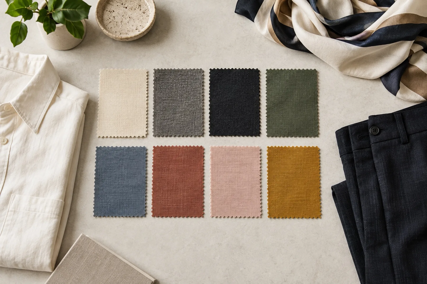
- Undertone — the hue beneath the skin. Pink-leaning skin reads cool, golden-leaning reads warm; olive often sits near neutral.
- Depth — how light or deep your skin, hair and eyes are together. Hair weighs almost as much as skin.
- Clarity — whether clean, saturated colors or greyed, blended ones suit you, from soft to clear. From a photo, the tool estimates it from skin–hair contrast and how vivid your eyes and skin read.
From 4 seasons to 12
The classic four seasons split by temperature and depth. The 12-season system adds clarity, so each family has a light or deep, a true, and a soft or bright member — and every season has neighbors you can be mistaken for.
Spring
Warm and clear — light, fresh colors.
Summer
Cool and soft — airy, blended colors.
Autumn
Warm and muted — rich, earthy colors.
Winter
Cool and clear — deep, high-contrast colors.
Take a photo with accurate color
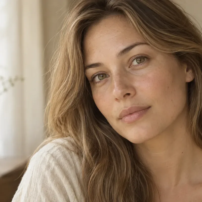
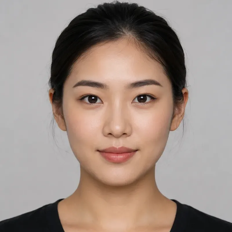
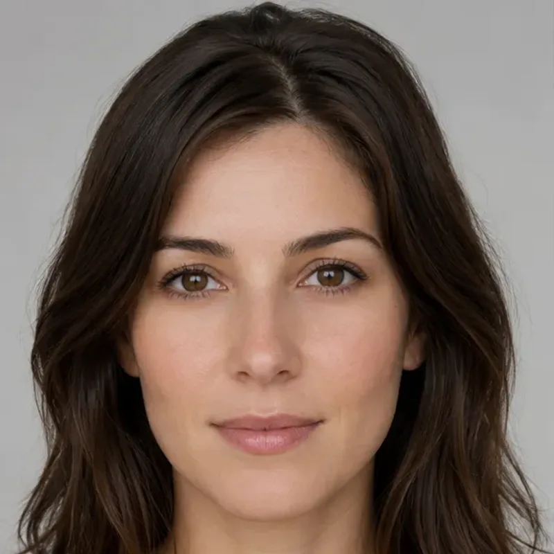
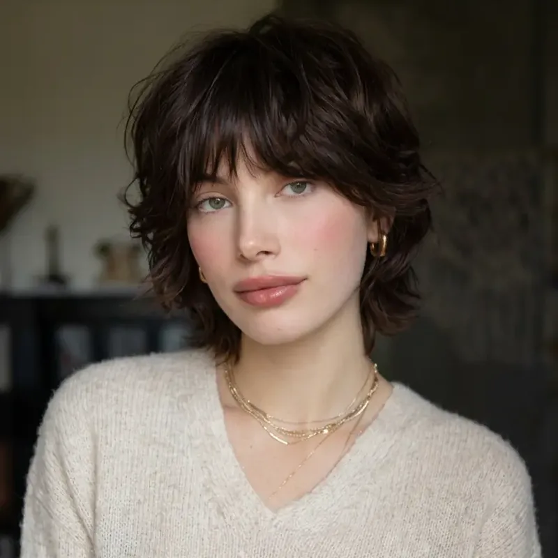
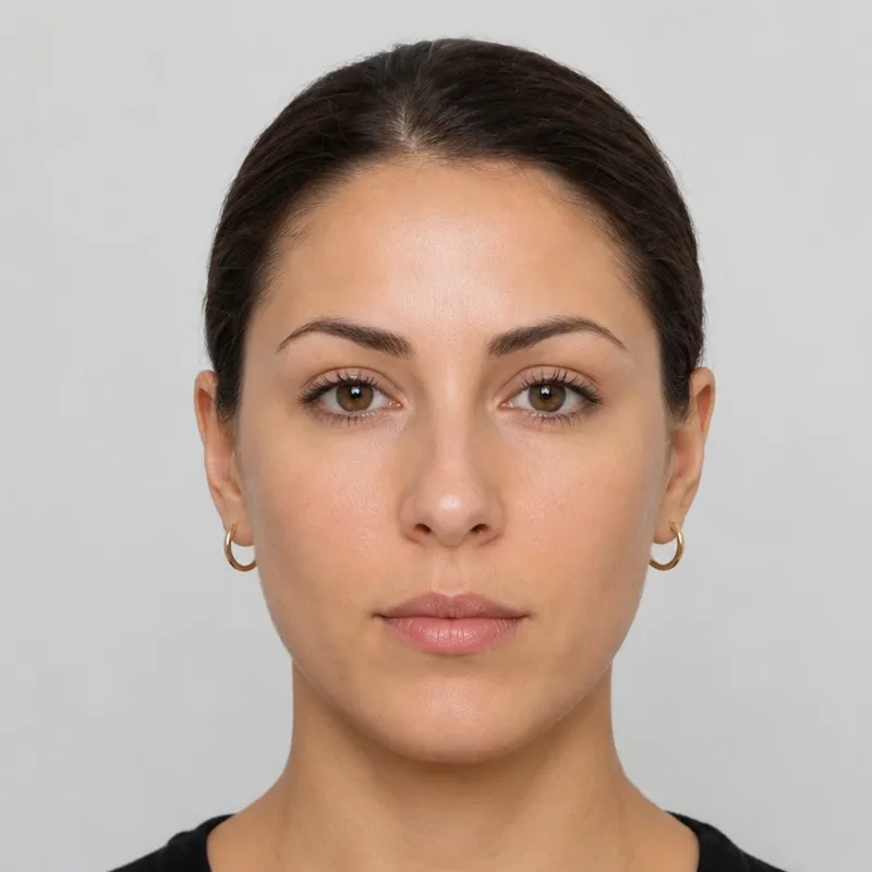
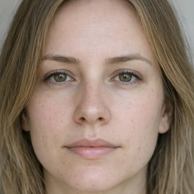
Wear white or light grey near the face so clothing doesn’t tint your skin, and if you can, lock exposure and white balance or hold a sheet of white paper in frame.
Why some colors make you look tired
Colors near your face change the contrast around it and can bounce tinted light onto your skin. Shades that are too bright, too dark, too saturated or the wrong temperature pull attention to the garment or make shadows stand out. It is a visual effect, not a health signal.
Quick check: hold the same top at your face, then below your waist. If only the neckline is the problem, a scarf or a better inner layer fixes it — no need to give the piece away.
Black, white or ivory? Test one variable
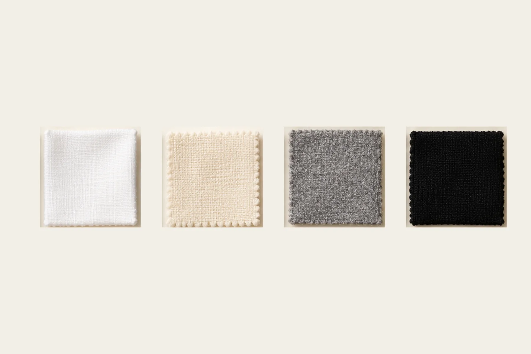
Compare pure white with ivory first, then black with charcoal, deep brown or navy. High natural contrast often handles black and white; softer coloring may prefer charcoal and soft white; warmer coloring can add cream. Starting points, not bans.
Two starter palettes to try
Original examples, not your result. Screens differ from fabric — check colors in person.
Cool-muted
Warm-muted
AI color analysis or a consultant?
| AI photo analysis | In-person consultant | |
|---|---|---|
| Input | Photos and a short quiz | Real fabric, live, with follow-up questions |
| Convenience | Fast; retake when the light changes | Booking and travel |
| Main limits | Camera color, lighting, model bias | Experience and system used |
| Worth checking | Candidates, uncertainty and reasons | A visible comparison process |
AI is a low-cost way to explore and shortlist. If your results keep changing, or you are planning a big wardrobe or hair-color change, an in-person draping is worth it. Either way, test colors in real outfits.
Method & sources
- The 12-season dimensions (The Concept Wardrobe)
- Close-range photography distorts facial proportions (PubMed)
Updated Oct 2026 · A styling framework, not a judgment. Results shift with light, camera and makeup.
Questions people ask
Want every decision made for you?
The full report (Complete plan) adds reasoning from a vision model, a 24-color palette, 3 hair plans with 6 AI try-ons that keep your face, glasses and outfit ideas. One-time payment; photo deleted from our systems within 24 hours.